Microsoft Starts Beta Testing its Arrow Launcher for Android
At the moment Arrow is only in private beta testing, but you can request an invite through the Arrow Google+ page. The Arrow Launcher is still in beta, but it already offers the same polished graphics experience, with apps displayed on the dock decided by the user.
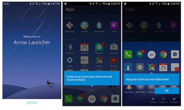
Microsoft’s approach to Android is minimalistic. The report shed light on its features as well. On the Apps page, which is also the Home page, you’ll see apps broken down into subcategories – a row of Recent ones at the top and three rows of Frequent apps on the bottom. It has three main pages that you can not add to or remove, and customization may be very limited. The latest is a custom launcher that repaints your home screen design and replaces the wallpaper with a serene background. A swipe to the right takes you to the Notes & Reminders page where you can type in a list of things to do and check a box once the task is completed.
Surprisingly it doesn’t have a Bing button prominently on the homepage, unlike some of Microsoft’s other efforts to get its search engine more prominent play on Android.
The third page is what differentiates it from most Android launchers as it is the Notes & Reminders page. Swipe left for an expanded list of shortcuts and recent contacts.
Similar to most Android launchers, the Arrow launcher includes a “dock” wherein users can easily access the most used apps. An additional feature of downloading a new wallpaper every day from Bing images is also available.
The new launcher does seem to have few limitations for instance, when it comes to customisation, users can not choose a ustom icon pack or change the icon size for the apps.


