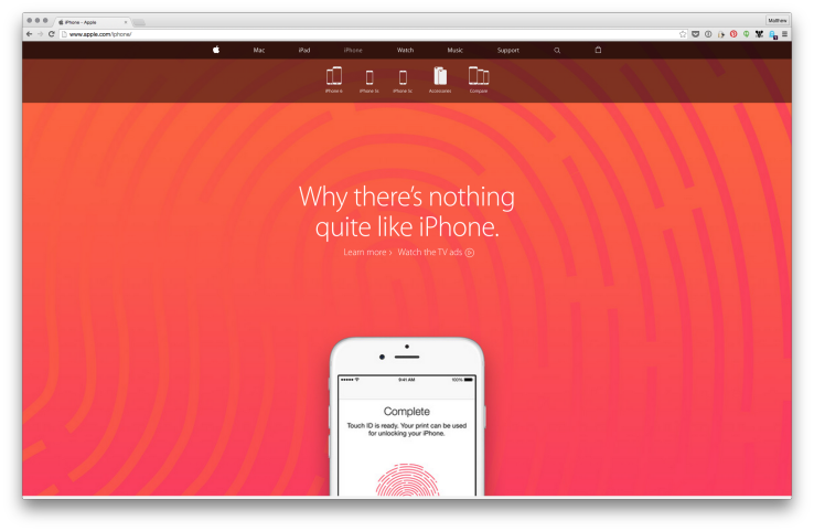
Apple redesigned website,kills separate ‘Store’ section
Visit Apple.com today and you’ll notice the company’s online store has been merged with its once-standalone website. Earlier, users could research and look at products in one page, and then had to navigate over to the store to actually buy them. The purchase pages for all these products have not been changed much and are similar to what they used to be on the Online Apple Store.
“We redesigned Apple.com knowing that our customers want to explore, research and shop in one place”, an Apple spokesperson told TechCrunch in a statement. He states that Apple has also improved numerous website’s features to make shopping easier for their valued customers.
The new structure makes it easier for users to navigate the website without having to switch back and forth between Apple’s main website and the now defunct storefront. Despite the major integration, Apple’s main site is largely unchanged, as are the product pages. There is no store.apple.com anymore.
As part of the redesign, Apple has completely removed the Store tab that has sat at the top of the home page for some time.
Looking for a new Mac, iPad, or iPhone? Apple’s product pages sport Buy buttons.
There’s a unified shopping cart now – welcome to 2015 Apple; and whatever you wish to put in there, will follow you wherever you go on the website, and a drop down sort-of menu will showcase what you’re spending money on. The revamped Apple.com, which receives more than 1 billion customers every year, is now live and available for shopping in 40 countries. Each individual device comes with its own sub-site, and a blue “Buy Now” button in the top right corner. Now, that’s all one experience. Usually, Apple Store is pulled down whenever Apple is scheduled to launch a new product, and people have all sorts of theories behind this rather unusual process.


