Pantone Introduces the Color(s) of the Year for 2016
“As consumers seek mindfulness and well-being as an antidote to the stress of modern day lives, welcoming colors that psychologically fulfill the yearning for reassurance and security are becoming more prominent”, Pantone stated in an official release. Pantone decides on a new color each year, based on a survey of fashionistas and other trendwatchers.
Pantone, which decides the color of the year, has made a decision to give the people more than they bargained for: two colors of the year.
Pantone seems to be doing its part to further gender equality, considering its 2016 Color of the Year is a two-fer – Serenity and Rose Quartz. A pink and blue duo, these hues for 2016 are calm, cool and collected, a harmonious pairing of complementary shades.
Although these infantile colors have been used as indicators of gender for newborns for years, with pink indicating a girl, blue signifying a boy, and yellow being gender neutral, these Pantone picks are meant to blur the lines between the two genders. “The 2016 Color of the Year allows our gentleman to use fashion to convey a sense of stability, constancy and a quiet authority – traits that are necessary in today’s turbulent world”.
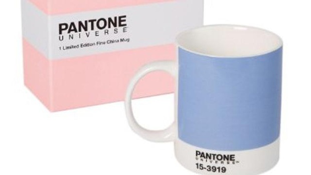
Serenity (Pantone 15-3919) and Rose Quartz (Pantone 13-1520) promote inner peace and tranquility, including in the home, Pantone said. You can also try dusting the baby pink shade across eyelids with Merle Norman Eyeshadow in Rosewater, for an unexpected twist on the trend.
In an increasingly busy and sometimes chaotic time, these colors are a call for serenity, says Laurie Pressman, vice president of the Pantone Color Institute.


