Uber has a new logo, and the Internet is displeased
Uber just unveiled a brand new look, saying it is “a fundamentally different company” than when it traded in its red, magnet-shaped founding moniker for a sleek black badge four years ago. Thus, their logo has to evolve to include something about “bits + atoms” in their new logo.
In a blog post detailing the reasons behind the big changes, Uber CEO Travis Kalanick likens it to getting a haircut.
Uber has recently been adding new services such as food delivery. This enables Uber to have a consistent design that highlights information and make the brand easy to recognise. “To bring out this human side…we’ve added color and patterns”, Kalanick wrote. Compared to the previous logotype, there’s tighter kerning, the weight of the letters is heavier and gone are the curves at the left tip of the U and on the right leg of the R. “Some might say it’s less fussy (in part because we have cut the curls, our 1990s hairstyle)”, Mr. Kalanick wrote. When you push a button on your phone, a vehicle moves across the city and appears where you are.
The design of the logo follows the company’s business ideology of curating its product and business models for specific regions.
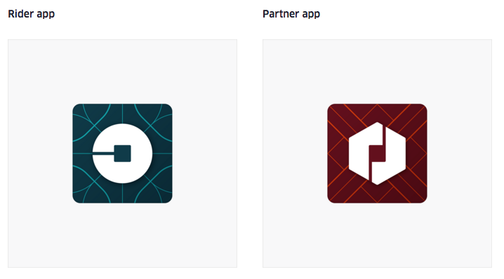
Uber has also refreshed the typeface for its main logo. This is visible in the app icon for both the riders and drivers.
According to Kalanick, the color combinations are based on local architecture, textile, scenerary, art and fashion to create “authentic identities” for each country. Mexico’s logo was inspired by pink tiles, for instance, while Ireland’s alludes to lush greens. “Every city has its own character and our long term goal is to have unique designs for cities as well as countries”.


